YouTube Thumbnail Design Tips for Beginners
A beginner-friendly set of design principles for making thumbnails that are clear, readable, and honest.
In this guide
- 1. Start With the Video Idea
- 2. Use One Main Subject
- 3. Choose a Clear Image
- 4. Keep Text Short
- 5. Use Large Fonts
- 6. Use Contrast
- 7. Create a Focal Point
- 8. Avoid Too Many Colors
- 9. Make the Thumbnail Match the Title
- 10. Test the Thumbnail at Small Size
- 11. Use the Correct Dimensions
- 12. Avoid Common Beginner Mistakes
- 13. A Simple Beginner Formula
- 14. Improve Through Practice
- 15. Frequently Asked Questions
Creating your first YouTube thumbnail can feel complicated when you see polished designs from established creators. You do not need advanced graphic-design skills to begin. You need a clear idea, a strong image, readable text, and a simple visual hierarchy.
Start With the Video Idea
Before opening a design app, identify the main promise of the video. Ask: What is the most important thing the viewer should understand? The thumbnail should reinforce that idea.
Use One Main Subject
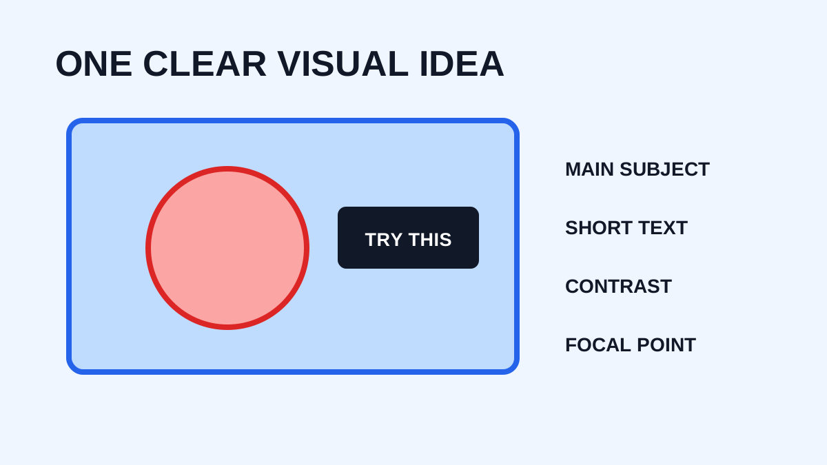
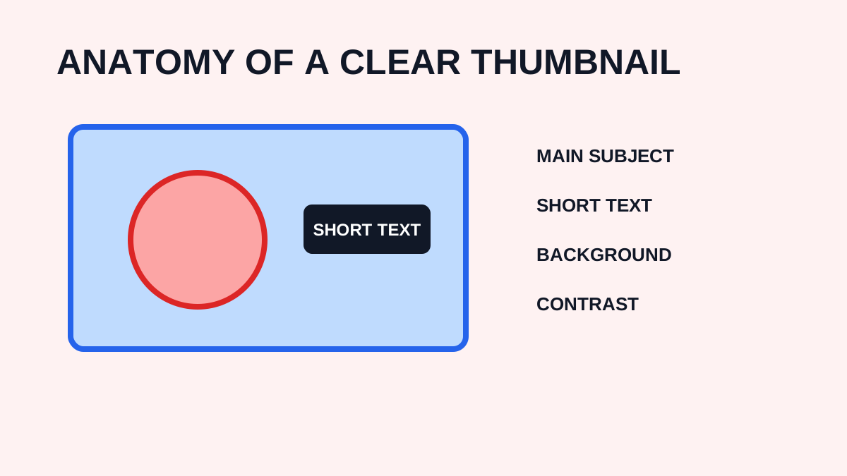
Beginners often add too many elements. Start with one main image, one short phrase, and one supporting element. Add more only if necessary.
Choose a Clear Image
Use an image that remains recognizable when reduced. Avoid extremely dark, blurry, or confusing source images.
Keep Text Short
Do not treat the thumbnail as a description. Use a few words that communicate the main idea, such as “BEFORE / AFTER”, “5 EASY TIPS”, “WORTH IT?”, or “NEW METHOD”.
Use Large Fonts
Tiny text may look good in the editor but become unreadable in YouTube's interface. Choose a bold, readable typeface and give letters enough spacing.
Use Contrast
Text should stand out from the background. Shadows, outlines, background boxes, gradients, or a simplified background can help, but effects should support readability rather than decorate every element.
Create a Focal Point
Decide what viewers should notice first. Make that element larger, clearer, or more visually prominent.
Avoid Too Many Colors
A limited palette often looks more professional than using every color. Choose a few complementary colors and use them consistently.
Make the Thumbnail Match the Title
The title and thumbnail should tell one coherent story. The thumbnail should not promise something the video does not deliver.
Test the Thumbnail at Small Size
Zoom out until the thumbnail resembles a feed card. If you cannot immediately recognize the main subject, simplify the design.
Use the Correct Dimensions
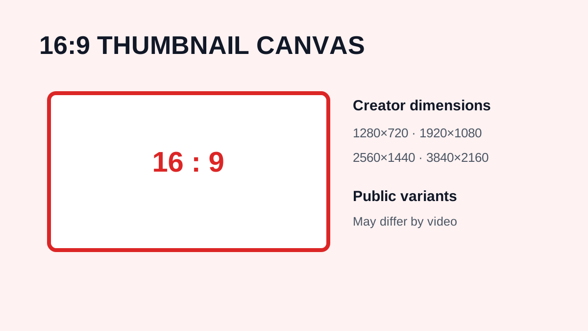
For standard videos, YouTube currently recommends a 16:9 aspect ratio and 3840 × 2160 pixels for custom thumbnails. For Shorts, YouTube currently recommends 9:16 for custom uploaded thumbnails. Check current platform requirements before publishing.
Avoid Common Beginner Mistakes
Too much text
A thumbnail is not a blog post.
Too many objects
Visual clutter makes the main idea harder to understand.
Weak contrast
Text disappears into the background.
Low-resolution images
The final thumbnail looks blurry.
Misleading visuals
The thumbnail attracts the wrong expectations.
Copying other creators
Use successful thumbnails as inspiration, but develop your own style.
A Simple Beginner Formula
Try: strong subject + short text + simple background + high contrast. It is easy to repeat and provides a solid starting point.
Improve Through Practice
Create several versions and compare them. Over time, you will develop a better understanding of composition, typography, color, contrast, visual storytelling, and audience expectations. You can use YTThumbnaile to study public examples without copying complete designs.
Frequently Asked Questions
Do I need Photoshop?
No. Many design tools can create effective thumbnails without Photoshop.
How many words should a thumbnail contain?
There is no strict universal limit, but shorter text is generally easier to read at small sizes.
What makes a thumbnail look professional?
A clear subject, good spacing, readable typography, strong contrast, and a consistent visual hierarchy.
What is the most important design rule?
Make the main idea easy to understand quickly.
Need to download a thumbnail?
Use the free YTThumbnaile downloader to retrieve the available public image resolutions from a YouTube video.
Download YouTube Thumbnail