YouTube Thumbnail Best Practices for 2026
A current, practical checklist for creators balancing clarity, originality, mobile readability, and honest packaging.
In this guide
- 1. 1. Make the Main Idea Obvious
- 2. 2. Use a Strong Visual Hierarchy
- 3. 3. Keep Text Short
- 4. 4. Design for Small Screens
- 5. 5. Use Contrast Intentionally
- 6. 6. Use Faces When They Add Meaning
- 7. 7. Create a Clear Focal Point
- 8. 8. Match the Thumbnail With the Title
- 9. 9. Avoid Misleading Clickbait
- 10. 10. Use the Correct Aspect Ratio
- 11. 11. Test Different Concepts
- 12. 12. Study Your Own Analytics
- 13. 13. Build a Recognizable Style
- 14. 14. Use High-Quality Source Images
- 15. 15. Keep Improving
- 16. Frequently Asked Questions
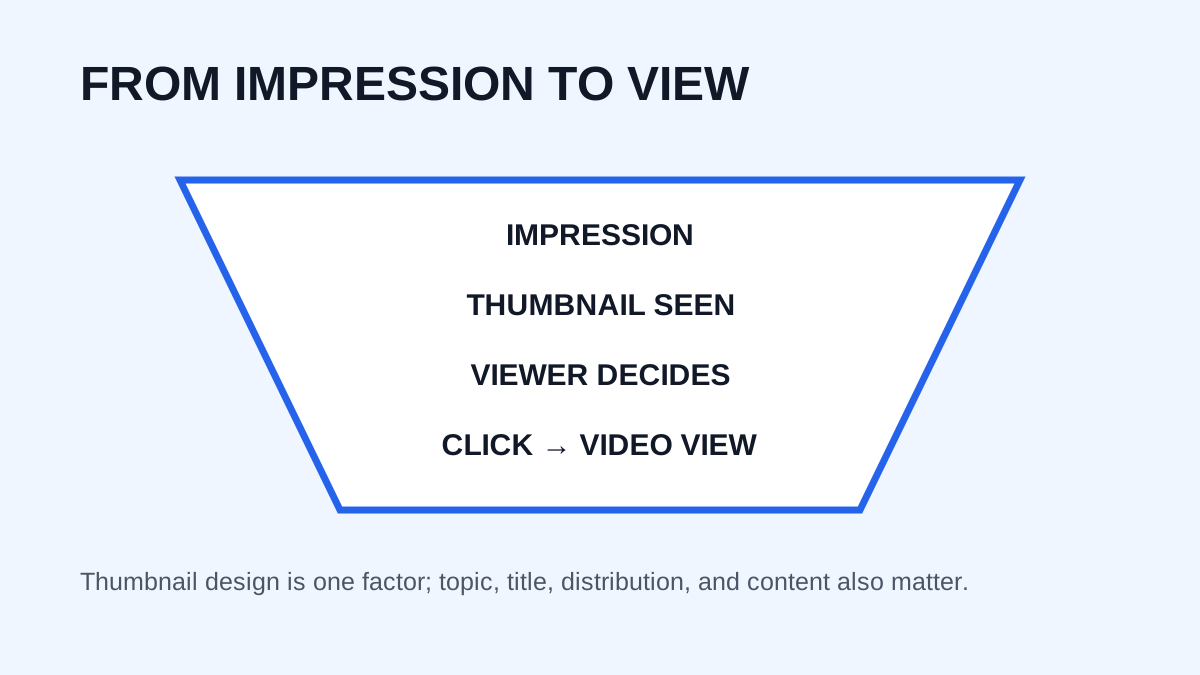
A YouTube thumbnail should help the right viewer understand what a video is about and decide whether it is worth watching. A good thumbnail is not simply colorful or flashy: it communicates quickly, remains readable at small sizes, and works with the title. In 2026, creators also have more tools for generating and testing ideas, making clarity and relevance more important than visual tricks.
1. Make the Main Idea Obvious
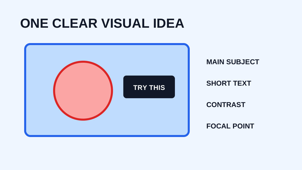
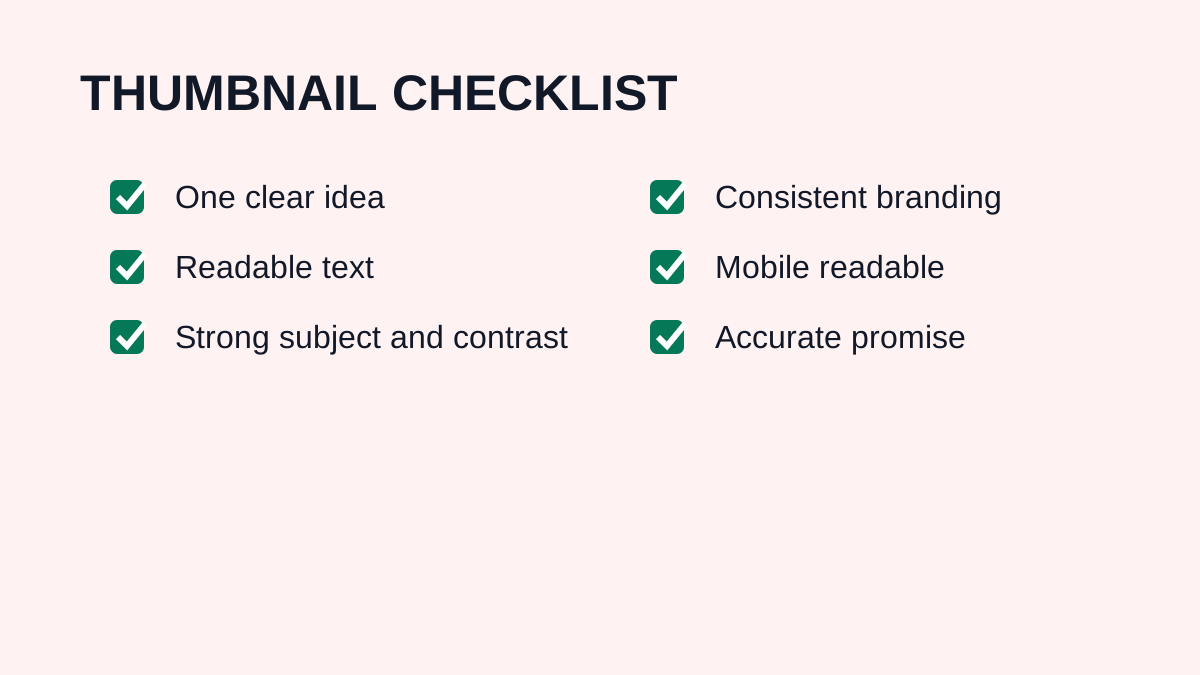
Choose one primary visual idea. A technology tutorial might show the product, a relevant result, one short phrase, and a recognizable cue. Viewers should not need to study the image.
2. Use a Strong Visual Hierarchy
Create a hierarchy of main subject, supporting visual, short text, and secondary details. This helps viewers process the thumbnail quickly.
3. Keep Text Short
Thumbnail text should support the visual rather than repeat the title. A detailed title such as “How to Download YouTube Thumbnails in High Quality for Free” might pair with a shorter “HD THUMBNAIL” phrase.
4. Design for Small Screens
Reduce the thumbnail before publishing and check whether the subject remains visible, text remains readable, contrast is strong, and the image still makes sense. If it only works enlarged, simplify it.
5. Use Contrast Intentionally
Contrast can come from light versus dark, large versus small, sharp versus blurred, warm versus cool, or simple versus detailed areas. Use it to guide attention instead of adding contrast everywhere.
6. Use Faces When They Add Meaning
Faces can communicate emotion quickly, but adding a face does not guarantee better performance. The expression should support the video's idea, such as surprise for an unexpected result or concentration for a tutorial.
7. Create a Clear Focal Point
Give immediate attention to a person, product, result, number, before-and-after comparison, or recognizable object. Avoid giving five elements equal importance.
8. Match the Thumbnail With the Title
The thumbnail can create curiosity while the title provides context. For example, a title about reducing editing time could pair with “2 HOURS → 1 HOUR”. The two elements communicate different parts of the same story.
9. Avoid Misleading Clickbait
A thumbnail can create curiosity without making a false promise. Strong thumbnails attract clicks by making content understandable and interesting, not by deceiving viewers.
10. Use the Correct Aspect Ratio
For standard videos, YouTube recommends a 16:9 format and currently recommends high-resolution source images, including 3840 × 2160. For Shorts, YouTube currently recommends 9:16 for custom thumbnails.
11. Test Different Concepts
If your channel has access to YouTube testing tools, compare meaningfully different concepts rather than nearly identical versions. Use the results to learn about your audience.
12. Study Your Own Analytics
Judge thumbnails with performance context, including topic, audience, impressions, CTR, watch behavior, and traffic source. A design that looks good to you may not be the best performer for your audience.
13. Build a Recognizable Style
A recurring font style, framing, accent color, layout, or subject position can make content easier to recognize. Consistency should not make every thumbnail identical.
14. Use High-Quality Source Images
Start with sharp source material. A low-resolution photograph cannot always be repaired by exporting at a larger size.
15. Keep Improving
Review strong and weak videos periodically. Look for repeated patterns in text, subjects, visual hooks, and engagement, then use those observations to improve future designs. Study public thumbnail examples with YTThumbnaile.
Frequently Asked Questions
What is the best YouTube thumbnail size in 2026?
YouTube currently recommends 3840 × 2160 pixels for video thumbnails with a 16:9 aspect ratio.
Should thumbnails contain text?
Text can help, but it should be short and readable. A strong visual can sometimes work better without text.
Are bright colors always better?
No. Contrast and relevance matter more than simply using bright colors.
Should I copy popular channels?
Study successful designs for ideas, but develop your own visual identity.
Does a better thumbnail guarantee more views?
No. Performance also depends on topic, title, audience, distribution, and video quality.
Need to download a thumbnail?
Use the free YTThumbnaile downloader to retrieve the available public image resolutions from a YouTube video.
Download YouTube Thumbnail